Census Data Visualized
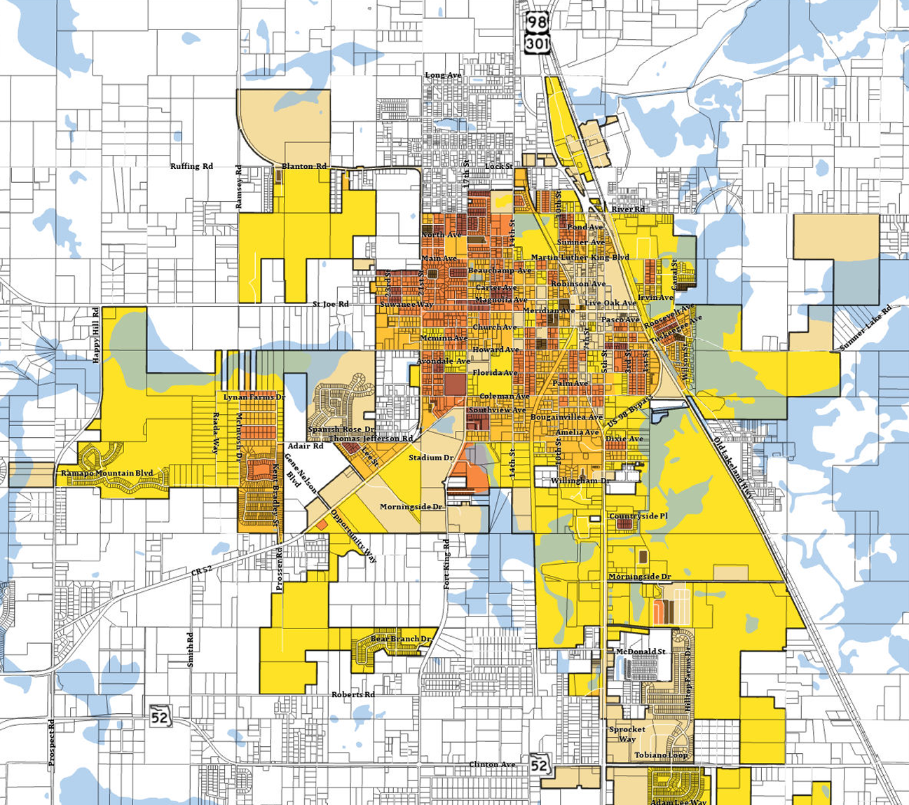
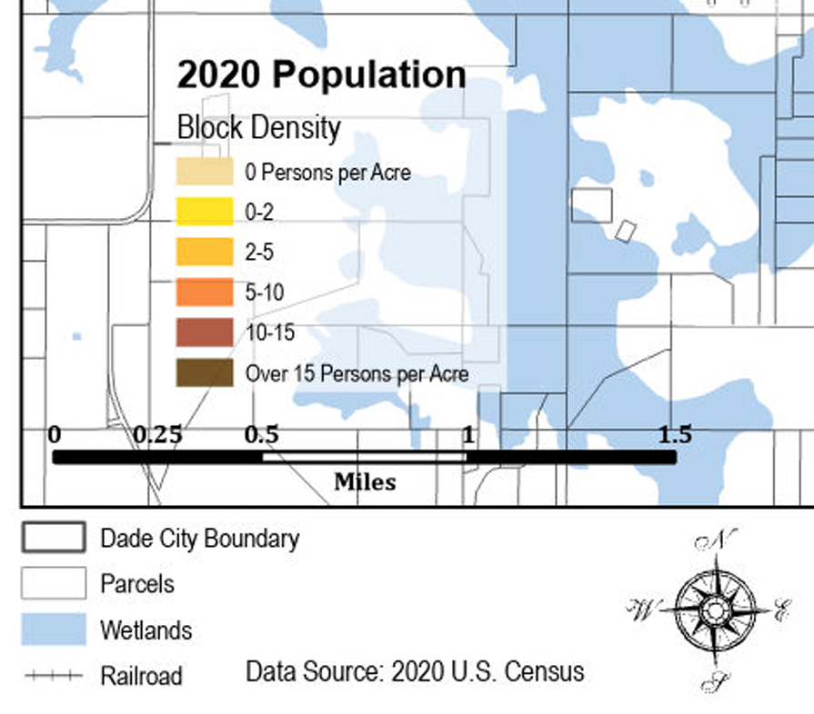
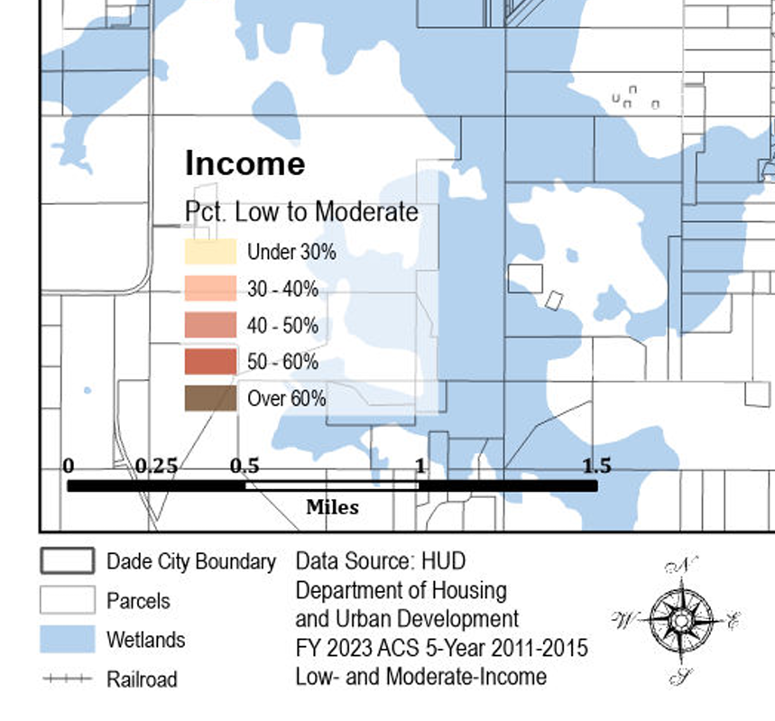
While Census data can be visualized in countless ways, these particular maps were created to update a required series of demographic exhibits for FEMA’s Emergency Response, Recovery & Operations (ERRO) Plan. The workflow involved clipping 2020 Census datasets—population by block, and income and poverty by block group—and applying clear thematic styles: tan‑to‑yellow‑to‑orange‑to‑brown for population density, green for income, and red/brown for poverty.
Although Census data lags behind the more current parcel‑level values shown elsewhere in this portfolio, the process is fully repeatable. With updated datasets and municipal boundaries, Craig Spatial can produce any Census‑based or demographic analysis needed. The only limitation is the Census aggregation level—blocks, block groups, and tracts—rather than parcel‑specific detail like that used in the Value Maps.
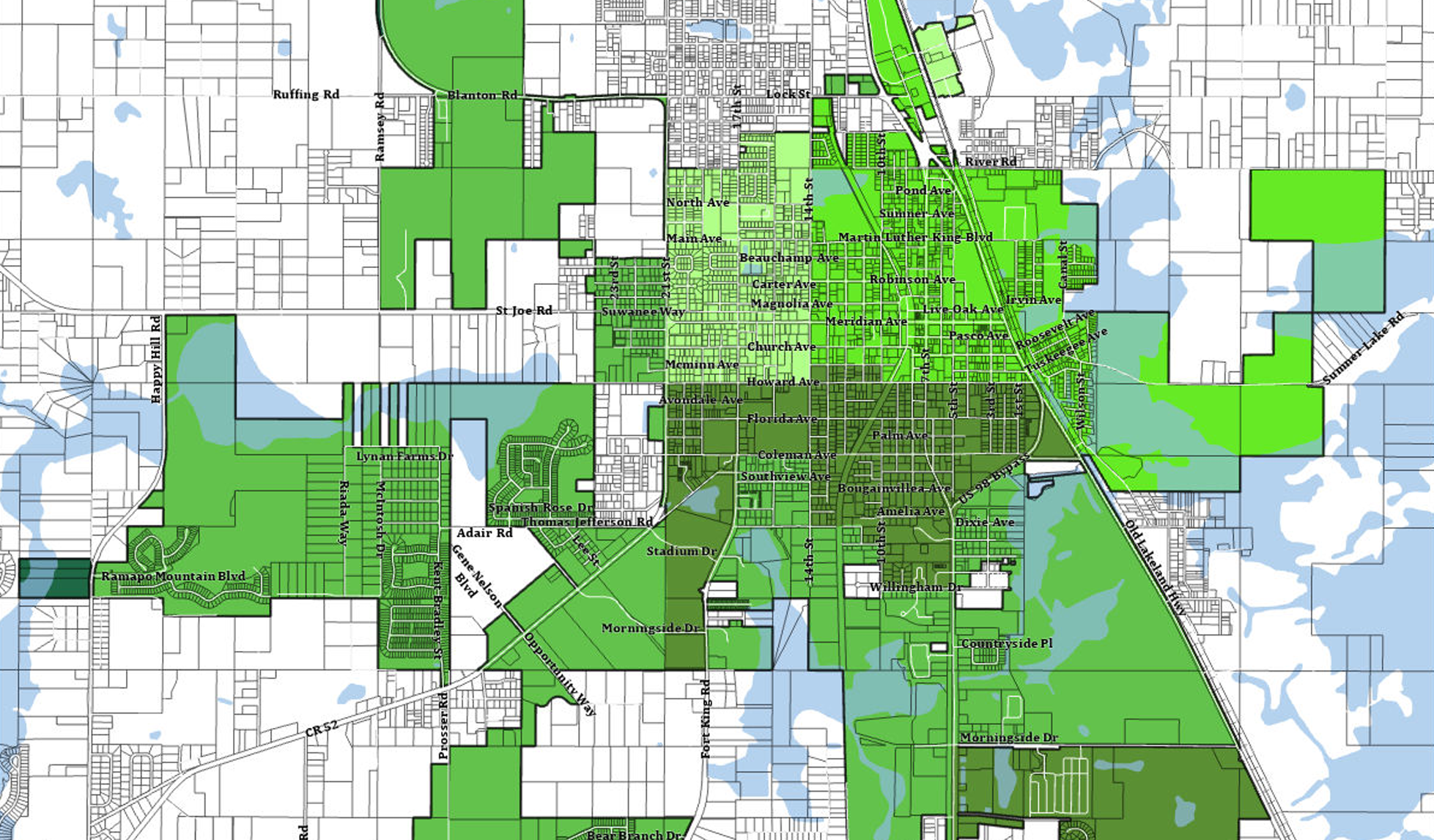
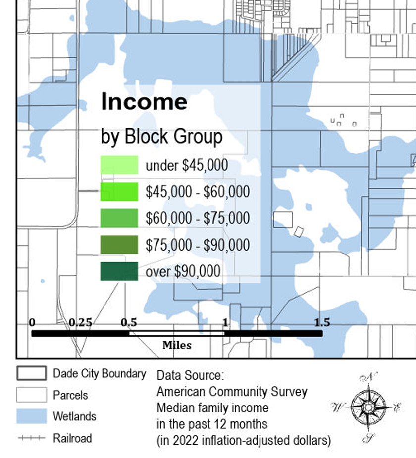
This Census map uses a green color scheme where darker greens represent higher income levels, creating a clear visual hierarchy. The surrounding unincorporated areas are shown in white, which provides a strong contrast against the fully symbolized income data within Dade City. The palette reinforces the intuitive association between deeper greens and the higher‑income, higher‑value neighborhoods within the city.
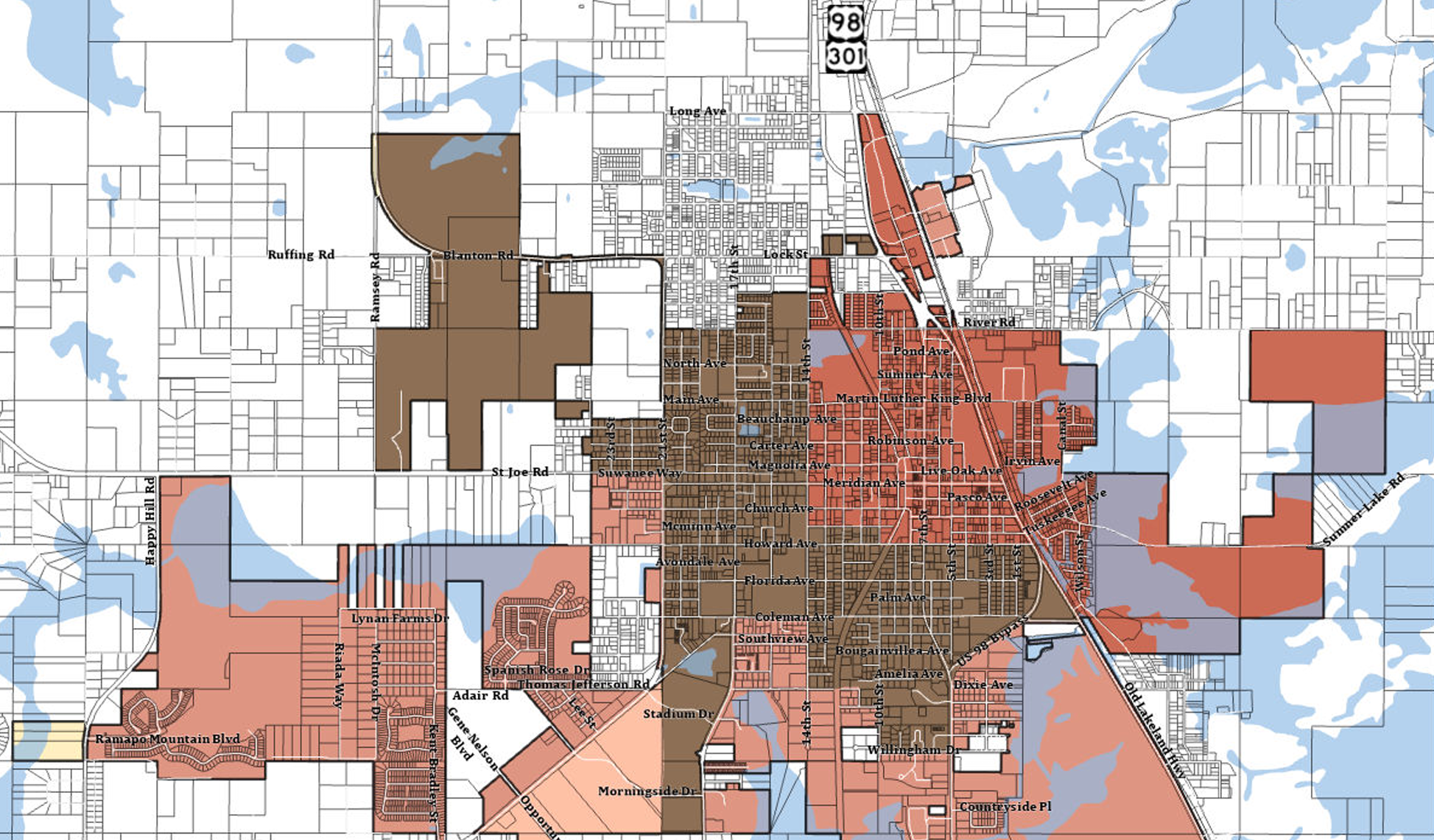
The wetlands shaded in lighter blue add useful context to the Census maps by showing the parts of the landscape that are uninhabited.